How the arkerah brand is designed
The arkerah brand is one name, one mark and one palette. The name is always lowercase and drawn as an outlined wordmark in Outfit Light. The mark is the first letter: an a with an arrow passing behind it and a lime dot as the target. The ground is Ink, a near black, and lime is kept for small things. The second brand kit arrived on 4 October 2026.
Where does the name arkerah come from?
The brand kit ties the name to the Spanish word arquera, which means archer. It reads the idea in three parts: the person is the arrow, arkerah is the archer, and the dot is the job that truly fits.
The name is written in lowercase, arkerah, everywhere in the product. That rule was set on 30 September 2026, when the first brand kit arrived, and it holds in page titles, in emails and in the wordmark itself. The wordmark is Outfit Light, outlined, with a lime dot in its first a. It did not change when the second kit arrived on 4 October 2026.
What is the arkerah mark?
The mark is called mark 04, the pierced a. It is the first letter of the name: the a of the wordmark, with its lime dot as the target. An arrow runs through it at 40 degrees, up to the right. The arrow goes behind the a, and a thin gap cuts it wherever it crosses the bowl or the stem, so it reads as one arrow through one letter.
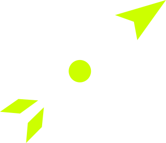
In the master drawing the whole mark is 81.9 units wide and 70.3 tall. The bowl is a circle with a radius of 19 and a stroke of 7, the dot has a radius of 5.5, and the tip of the arrow sits 55 from the centre. The kit draws the mark at four sizes, and the product picks the drawing that matches the size it is shown at.
| Size shown | Drawing | What changes |
|---|---|---|
| Above 64 px | The master | The full mark: the a, the arrow, the gaps and the dot |
| Up to 64 px | The 64 px drawing | Heavier strokes and wider gaps, so the counter and the cuts stay open |
| Up to 32 px | The 32 px drawing | Heavier strokes and wider gaps, drawn for 32 px |
| Up to 16 px | The 16 px drawing | The arrow is dropped and only the a with its dot remains, because at that size the arrow turns to noise |
Where may the mark and the name appear?
The kit sets rules for the name and for the mark, and the product's components follow them. The first keeps the two apart: the name and the mark never sit side by side, and the only place they meet is the animation, where the mark becomes the first letter of the name.
- The wordmark is at least 100 px wide on screen, with one letter height of clear space on every side. Where there is less room, the icon is used instead.
- The mark is at least 32 px wide, with a quarter of its width as clear space. Below 32 px, the 16 px icon is used.
- Lime stays rare. On white or light grounds the ink files are used: the arrow turns ink and only the dot stays lime, inside the a.
- The drawing is left alone. The mark is not rotated, the angle of the arrow is not changed, the gaps are not closed, the wordmark is not retyped, and no shadow or outline is added.
Which colours does arkerah use?
The palette is mostly Ink, with white for letters and marks and a touch of lime. Ink is the ground of the whole product, and the greys around it are warm.
| Name | Hex | Use |
|---|---|---|
| Ink | #0C0E0A | The ground. Ink marks on light and lime grounds |
| Ink 2 | #161913 | Raised surfaces on Ink |
| White | #FFFFFF | Letters and marks on Ink |
| Lime | #CCFF00 | The dot, the head and feathers of the arrow, the app tile |
| Grey 100 | #E4E6E0 | Light surfaces, and lines on light |
| Grey 500 | #9A9D95 | Secondary text on Ink only |
| Grey 800 | #2A2D27 | Secondary text on light grounds |
Lime is never used for text or for large surfaces. In the product, the landing footer and the map tile are Ink 2 with a hairline border, because on an Ink ground a surface in Ink would have no edge. Lime stays on small controls: the main button, the send button, the count on the bell and link text. Grey 500 measures 2.75 to 1 on a light ground, which is too low for text, so it is used on Ink only.
Which typeface does arkerah use?
arkerah uses Outfit, published under the SIL Open Font License, in weights 300, 400 and 500. The wordmark is Outfit Light turned into outlines, so it never depends on the font being installed and is never retyped.
The product serves its own copy of the font. It is cut to the kit's weight range and split into two files, 24.6 KB for Latin and 10.2 KB for Latin extended, and it is preloaded, with no link to Google Fonts. Older styles in the product ask for heavier weights in about 150 places, so the browser is told not to fake a bold, and those texts render at weight 500.
Switching the font cost nothing measurable. Lighthouse's mobile preset, run on a local production build of the sign-in page when the font was switched, gave a median largest contentful paint of 2.37 seconds before and 2.38 seconds after.
What is the Into the word animation?
Into the word is the brand animation. It lasts six seconds, plays once and holds on the wordmark. The lime dot appears, the bowl of the a draws itself around it, the stem grows down, and an arrow flies in from the lower left and lands through the a. The arrow then flies on out of frame, the a shrinks into the first letter of the name, and the other six letters slide in one after another.
| Time in seconds | What happens |
|---|---|
| 0.25 to 0.72 | The lime dot appears |
| 0.62 to 1.42 | The bowl draws itself anticlockwise around the dot, starting at the stem |
| 1.30 to 1.72 | The stem grows down |
| 1.86 to 2.14 | The arrow lands through the a, the a shudders, the dot flares and a lime ring spreads |
| 2.62 to 3.12 | The arrow flies on, out of frame |
| 2.85 to 3.75 | The a shrinks into the first letter of the wordmark |
| 3.30 to 4.14 | The other six letters slide in, one after another |
| 4.14 to 6.00 | Hold on the wordmark |
The last frame matches the static wordmark to within anti-aliasing, so the animation can hand over to the logo with no jump. It is built as a web component with no dependencies and no font, because its letters are the wordmark's own outlines. With reduced motion switched on, it shows the last frame and never moves. The product's loading screen uses its opening as a 2.4 second loop, and the animation itself is not yet played anywhere in the product.
How does the product use the brand kit?
One kit supplies every view. The colours live in one place, the root of the product's stylesheet, and every screen reads them. The kit's files supply the browser tab icon, the touch icon, the web app manifest and the link preview image, and the loading screen shown before any page is ready is the kit's loader.
Two components draw the brand, and they never render each other. One draws the name only, in three fixed sizes of 104, 128 and 176 px, so it cannot be asked for below 100 px, and it carries one letter height of clear space as padding. The other draws the mark on the lime tile and picks the kit's drawing by size. The one place that holds both, the navigation of the landing page, shows the name from 420 px wide and the icon below that, because the name needs 100 px and the buttons beside it have to fit. Automated checks hold all three rules.
Questions
Why is arkerah always written in lowercase?
It is the brand's rule, set on 30 September 2026: the name is arkerah, in lowercase, everywhere. The wordmark is drawn that way.
How small can the arkerah name be shown?
At least 100 px wide on screen. Where there is less room the icon is used, and below 32 px wide the 16 px icon is used.
Does the mark ever sit next to the name?
No. The name and the mark live apart. They meet only in the Into the word animation, where the mark becomes the first letter of the name.
Is the Into the word animation in the product?
Not yet. The kit has it ready as a web component, and the product's loading screen already uses its opening as a short loop.
Does arkerah load its font from Google?
No. The product serves its own Outfit files and has no link to Google Fonts.
Why is lime kept away from large surfaces?
Because the kit's second rule is that lime stays rare. It is used for the dot, the head and feathers of the arrow and the app tile, and in the product for small controls.